The 5 Colors Creative People Gravitate Toward The Most
Creative people accumulate color the way other people accumulate opinions: constantly, compulsively, and with total conviction that this particular one means something. Walk into the studio, the study, the kitchen table that doubles as a design office at midnight, and the color is always there — on the walls, on the shelves, in the paint-stained shirt that wasn’t supposed to become a painting shirt.
Color preference is, in its quiet way, a map — drawn by the nervous system without conscious input, pointing toward the specific conditions under which a particular mind does its best work. Color psychology research has spent decades mapping what happens inside the brain when certain colors enter the visual field, and what keeps emerging is that the colors creative people reach for most have been trying to tell them something all along.
Here are 5 colors that have a magnetic pull on creative people.
1. Green
Green sits at the center of the visible spectrum, processed by the eye with less effort than any other color, and research in environmental psychology has found it consistently restorative — rebuilding the specific quality of attention that long creative work depletes. The mind lands on green the way a tired person lands on a couch. It has colonized the studios of people who work slowly and at length: the illustrators filling sketchbooks over months, the writers who won’t show anyone a page until the whole thing is ready, the composers who need something alive in the room before they can hear the music clearly.
Green is the color of the long middle. Not the flash of inspiration, not the finished thing — the sustained, unglamorous stretch of work in between, which turns out to be where most of the actual making happens. The people who gravitate toward it tend to know this, even if they couldn’t tell you why they repainted the walls.
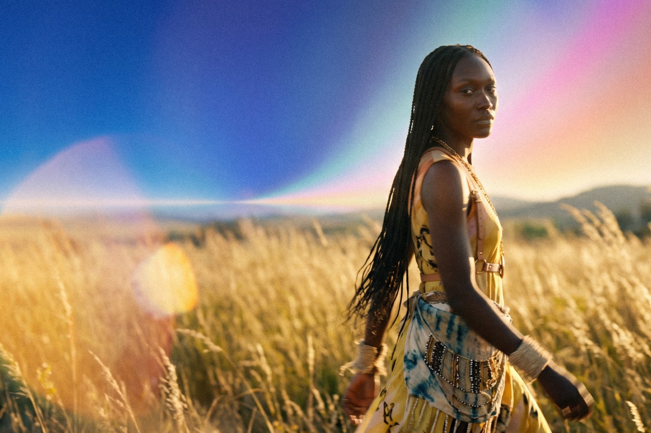
2. Yellow
Yellow is mentally activating in a way that is categorically distinct from every other color on this list. Research ties it to heightened curiosity and spontaneous association — the open, combustible cognitive state that generates new ideas faster than any reasonable person can act on them. Find it in the workspaces of people with seventeen half-finished projects and genuine enthusiasm for every single one, people who get a new idea in the middle of explaining the last idea, people whose desks look like a collision between a brainstorming session and a small natural disaster.
The energy yellow produces is more interested in ignition than in the long burn. It is not the color of the finished thing. It is the color of the moment the finished thing became possible, which to a certain kind of mind is the only part that ever really counted.
3. Purple
Purple sits at the outermost edge of the visible spectrum, one step from frequencies the human eye cannot reach at all. Color researchers describe it as a bridge between the analytical and the intuitive, and it runs through the work of people who operate at similar edges — between genres, between disciplines, between what currently exists and what doesn’t yet. The painter whose canvases don’t fit any obvious category. The writer whose books get shelved in three different sections depending on the store. The musician whose influences, when listed, raise more questions than they answer.
Work that gravitates toward purple tends to generate strong reactions rather than mild ones: total bewilderment from people who weren’t ready, or fierce recognition from people who feel it was made specifically for them. Purple has never been particularly interested in the former group, and neither, as a rule, has the work made under its influence.
4. Blue
A 2009 University of British Columbia study found that blue environments produced measurably more original creative output than red ones — not because blue stimulates, but because it opens. It calms the nervous system just enough to produce a state of unhurried mental availability that urgency actively forecloses. This is a color that rewards the people who can tolerate not knowing yet — the ones who stay inside a problem long enough for it to give something up, who resist the pull toward the nearest available answer and wait for the right one. The work that comes out of that patience tends to be the kind that makes everyone else feel they moved too fast.
The thinking blue enables is the kind that needs room and refuses to be rushed. Blue is why the best thing in the room sometimes comes from the person who said the least.
5. Orange
Orange is the most socially activating color on this list. Research links it to increased cerebral oxygenation and a quality of enthusiasm that moves outward rather than burning privately inward — which is why it shows up on the walls of every space designed for people to make things together. It doesn’t just affect the person looking at it. It changes what becomes possible between people, raises the temperature of a room, turns a meeting into a session and a session into something none of the people involved had quite planned on.
Orange is present in every collaboration where no one can quite remember afterward whose idea it originally was, every project that produced something nobody could have made alone. It runs warm. It always has.